Google announced in November 2016 that over the next few months it would change the way it orders the different websites, giving priority to mobile browsing.
Internet is mobile and the figures prove it. According to the report The Information Society in Spain in its 16th edition, 88.3% of Internet users access the Internet through their smartphone , while 78’2% use their computer. It was logical that, if the majority of searches are performed on mobile devices and, if Google refers to the mode in the one the user browses, the search engine ends up making changes to its indexing algorithm.
 Among other things, Google recommends an adaptive code for each device. Each screen has particular characteristics, so the way in which the user interacts with the web will often change. For example, buttons intended for desktop do not work as in mobile , in the same way as touch functions cannot be used on the desktop. It is necessary that there are elements adapted to each of these devices , all under the same code if we have a web responsive .
If we integrate structured data, we must avoid adding irrelevant data. Similarly, we must ensure that all our content is visible to Google, so we must limit the use of tags Javascript and be clear that, if the search engine already I was blind to flash , Android and iOS too They are, so if you include content of this type, the user will not be able to interact with your website from a mobile either.
Check that the file robots.txt allows accessibility to Googlebot and don’t worry about your canonical bindings as, if they worked correctly until now, they will continue to do so.
Yes, it will be necessary to make changes to Search Console to include your mobile website if you haven’t already done so and if you only have a web version, consider generating a mobile-friendly one as soon as possible.
If it was already important that the pages were light, now it is more so and Google pays attention to it, since the user has limited their consumption of data in smartphone . Avoid overloading images and try to publish them in JPG format instead of PNG, which can weigh up to double. If your page is very dense, it will take longer to load and you will get a higher bounce rate, which will penalize your positioning.
Among other things, Google recommends an adaptive code for each device. Each screen has particular characteristics, so the way in which the user interacts with the web will often change. For example, buttons intended for desktop do not work as in mobile , in the same way as touch functions cannot be used on the desktop. It is necessary that there are elements adapted to each of these devices , all under the same code if we have a web responsive .
If we integrate structured data, we must avoid adding irrelevant data. Similarly, we must ensure that all our content is visible to Google, so we must limit the use of tags Javascript and be clear that, if the search engine already I was blind to flash , Android and iOS too They are, so if you include content of this type, the user will not be able to interact with your website from a mobile either.
Check that the file robots.txt allows accessibility to Googlebot and don’t worry about your canonical bindings as, if they worked correctly until now, they will continue to do so.
Yes, it will be necessary to make changes to Search Console to include your mobile website if you haven’t already done so and if you only have a web version, consider generating a mobile-friendly one as soon as possible.
If it was already important that the pages were light, now it is more so and Google pays attention to it, since the user has limited their consumption of data in smartphone . Avoid overloading images and try to publish them in JPG format instead of PNG, which can weigh up to double. If your page is very dense, it will take longer to load and you will get a higher bounce rate, which will penalize your positioning.

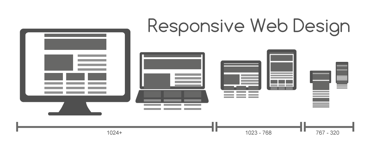
Mobile First: prioritize the mobile version of your website
Mobile First is a concept that refers to the need to design a website giving priority to the design and operation of the mobile version . Consider that the mobile will probably be the most demanding device from which your website will be visited due to the variety of terminals on the market (different sizes, screen resolutions, power, sensors …). If your website is perfectly adapted to mobile, it should not be difficult to obtain the desktop version. You can check if your mobile version is well adapted according to the optimal parameters for SEO in Google: Mobile friendly test tool Until now, the search engine indexed based on the characteristics of the desktop version of a page, but from now on it will be able to analyze parameters related to its adaptation to the screens and usability of mobile devices, giving priority precisely to those sites who have known how to adapt better.How does the new algorithm affect my SEO in Google?
Although it has been commented that those websites that do not have a mobile version should not worry about being indexed anyway, it is true that it will affect SEO. Faced with two websites that compete in positioning, Google will give priority to the one that is capable of adapting to mobile phones. Whoever has a website will have no problem responsive < span style = "font-weight: 400;"> or a dynamic publication website, since Google will consider that the content is adapted to mobile devices and that in both cases it is the same. Yes, changes will have to be made if the content displayed on mobile and desktop is different.Tips to rank better in Google with mobile indexing
Among other things, Google recommends an adaptive code for each device. Each screen has particular characteristics, so the way in which the user interacts with the web will often change. For example, buttons intended for desktop do not work as in mobile , in the same way as touch functions cannot be used on the desktop. It is necessary that there are elements adapted to each of these devices , all under the same code if we have a web responsive .
If we integrate structured data, we must avoid adding irrelevant data. Similarly, we must ensure that all our content is visible to Google, so we must limit the use of tags Javascript and be clear that, if the search engine already I was blind to flash , Android and iOS too They are, so if you include content of this type, the user will not be able to interact with your website from a mobile either.
Check that the file robots.txt allows accessibility to Googlebot and don’t worry about your canonical bindings as, if they worked correctly until now, they will continue to do so.
Yes, it will be necessary to make changes to Search Console to include your mobile website if you haven’t already done so and if you only have a web version, consider generating a mobile-friendly one as soon as possible.
If it was already important that the pages were light, now it is more so and Google pays attention to it, since the user has limited their consumption of data in smartphone . Avoid overloading images and try to publish them in JPG format instead of PNG, which can weigh up to double. If your page is very dense, it will take longer to load and you will get a higher bounce rate, which will penalize your positioning.
AMP: Acelerated Mobile Pages
To go one step further, Google suggests using a AMP version from your website. Accelerated Mobile Pages is a very refined web format , which dispenses with ornaments and flourishes to prioritize over all content: CSS limitation, images that only load when they are on screen (they are usually loaded with the rest of the page), simplified menus and options not present. Upload speeds are dramatically reduced, as does data usage. Better SEO is being achieved in Google for those websites that have AMP.
Aplicaciones para mejorar tu posicionamiento
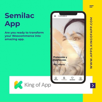
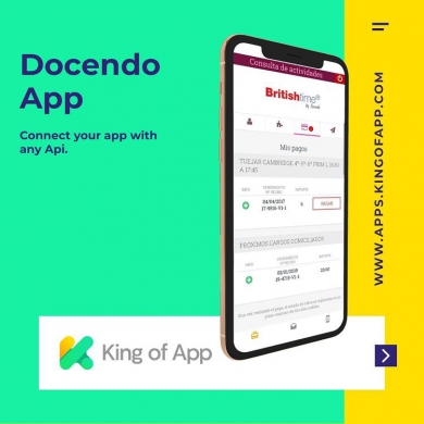
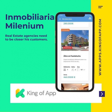
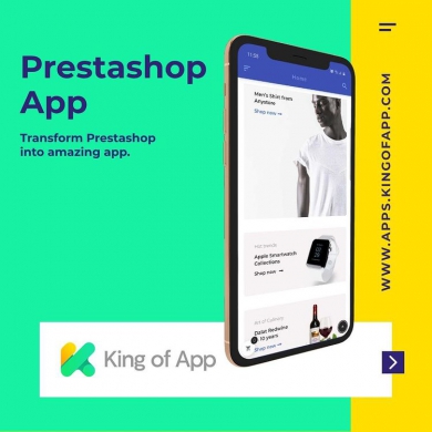
Google también está indexando aplicaciones para Android y iOS en su buscador, favoreciendo a aquellas compañías propietarias de una app. Combinar una web correctamente adaptada a pantallas pequeñas y contar con una app para tu negocio te ayudará a obtener una mejor posición en buscadores. King of App te permitirá crear una aplicación de manera rápida y sencilla. With an app and a website you can combine ASO and SEO actions, achieving synergies that will favor your positioning in the search engine. In this article we comment the importance of mobile marketing in your business strategy , referring to the need to combine actions and take advantage of the advantages of mobile devices. Are you interested in having your own app to complement it with your SEO strategy in Google? Try King of App now. Create your application for iOS and Android. Choose a theme, combine modules and add services to get the app you need.