Navega por las apps, com si estuvieras en tu móvil. Si necesitas usuario y pass usa este:
User: app_king
Pass: 123@pP456
Crea cualquier tipo de aplicación para:
Apple
Android
PWA
Bienvenido al constructor de apps
Un CMS en línea que te permite crear cualquier tipo de app móvil para iOS y Android.
Puedes crear apps sin código usando más de 400 funcionalidades que tienes listas para usar, o si eres un usuario profesional tienes acceso total al código: sin límites. Y cuando tengas tu aplicación lista, disfrute del sistema automático para publicar su aplicación en Apple Store y Google Play.
Una solución de marketing móvil 360: App Builder, publicación automática, herramienta para el mantenimiento de los proyectos, academia y soporte profesional.
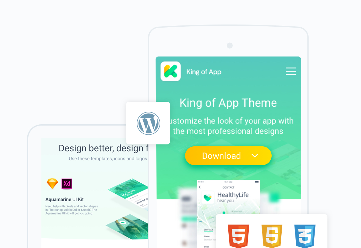
Transforma cualquier web en app
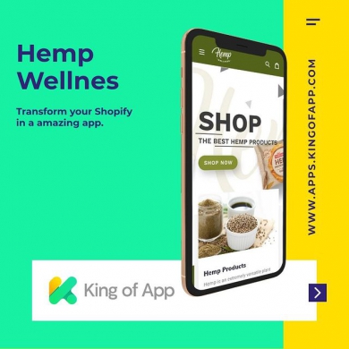
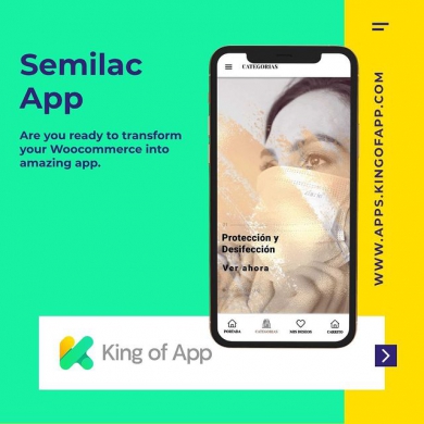
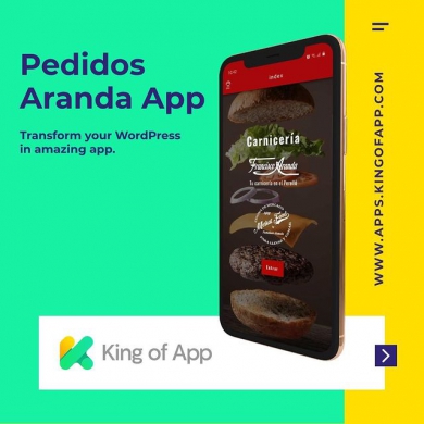
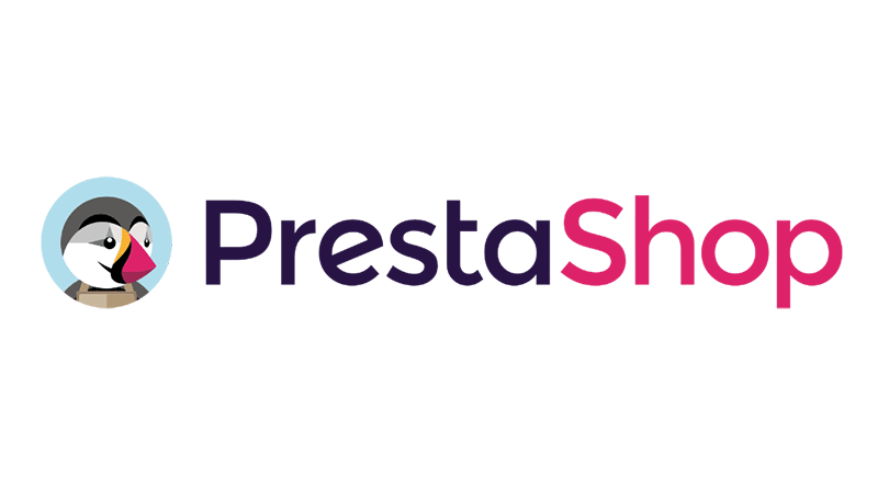
En KOA disponemos de diferentes técnicas para transformar tu web en app rápidamente. Encontrarás distintos tipos de plugins para WordPress, Prestashop, Google Sheet, Woocoomerce, Vtex, Shopify, Drupal, Magento, Joomla, Wix, Blogger o webs de código propio y transformarlas en aplicaciones móviles listas para publicar en los markets oficiales.
Podrás importar todos los datos en tiempo real para optimizar tu trabajo y hacer más fácil la gestión de contenidos. También podrás importar funcionalidades, reglas de negocio, sistemas de pago, …
Y así podrás multiplicar las funcionalidades de tu app hasta el infinito!
"Crea apps al estilo de WordPress"
¿Qué es King of App y que puede ofrecerte ?
Creamos King of App porqué cada vez que queríamos crear una app, el precio era muy alto y muchos clientes no podían permitírselo.
Las soluciones que encontrábamos eran cerradas, no nos dejaban ni acceder al código, ni personalizar las apps, ni agregar nuevas funcionalidades.
Por eso creamos KOA , una solución Open Source que nace con la idea de poder crear apps con herramientas web y poder reutilizar el código. De esta manera, el esfuerzo de un proyecto se multiplica con el efecto de la comunidad.
El proceso de crear una app y una web son diferentes, el proceso de publicar una app mobile en los markets de iOS y Android.
Por eso hemos creado un sistema automatizado para hacerte el proceso más fácil, y como este servicio tenemos muchos más para que crear apps no tenga límites para ti.
Quiero montar mi negocio de creación de aplicaciones
Si quieres montar tu propio negocio de creación de apps has llegado al lugar indicado.
Te proporcionaremos una solución 360 grados: Un software sin limites que te permite escalar y sea transparente, herramientas de testing y autopublicación, herramientas para llevar el mantenimiento de tus apps, academia de formación y soporte técnico. Con esta presentación entenderás lo que necesitas para crear un negocio de éxito.
Busco una agencia para que desarrollen mi proyecto de app
King of App es una herramienta profesional y muchas veces nos encontramos con clientes que quieren aprovechar las capacidades de nuestro constructor para tener una app potente y económica, pero a la vez no disponen del tiempo o de los conocimientos para crearla.
Si lo que buscas es transformar tu web en app, tenemos soluciones perfectas. Y si requerimos de una solución más completa, estudiaremos tu proyecto y te haremos un presupuesto a la medida.
Estoy buscando una solución para crear una sola app
Si eres un manitas digital y estas buscando una solución do-it yourself, para crearte la app tu mismo, King of App puede ser tu herramienta. Somos una solución pensada para profesionales, aunque gracias al constructor Drag and Drop es fácil de utilizar, eso si te recomendamos que hagas este curso en nuestro canal de youtube.
En este curso te enseñaremos paso a paso las cosas básicas que necesitas saber para desarrollar tu app con agilidad.


